CPL One’s design studio has created a new look for a global human rights organisation.
Over recent months, CPL One has been working with one of our longstanding clients – The Death Penalty Project (DPP) – to develop its new visual brand identity.
Since 1975, DPP has been working globally, taking action to protect the rights of people facing death sentences and promoting fair and effective criminal justice systems.
Fifty years since the organisation’s mission began, the DPP team wanted to refresh its communications across all channels, celebrating the charity’s history and amplifying the importance of its ongoing work around the world.
Having developed a fresh new brand strategy and tone of voice, and committed to a website relaunch, DPP appointed us to develop its new visual identity.
“The team at DPP had completed a comprehensive revamp of the organisation’s brand strategy; who it was, how it positioned itself and how it wanted to talk to people,” says Robyn McCurdy, our design lead on the project. “We wanted to align and consolidate the visual identity to reflect the updated brand positioning.
“With the new design, we needed to reflect a brand that was compelling, memorable and accessible, as well as showcasing DPP as being the primary expert in its field.”
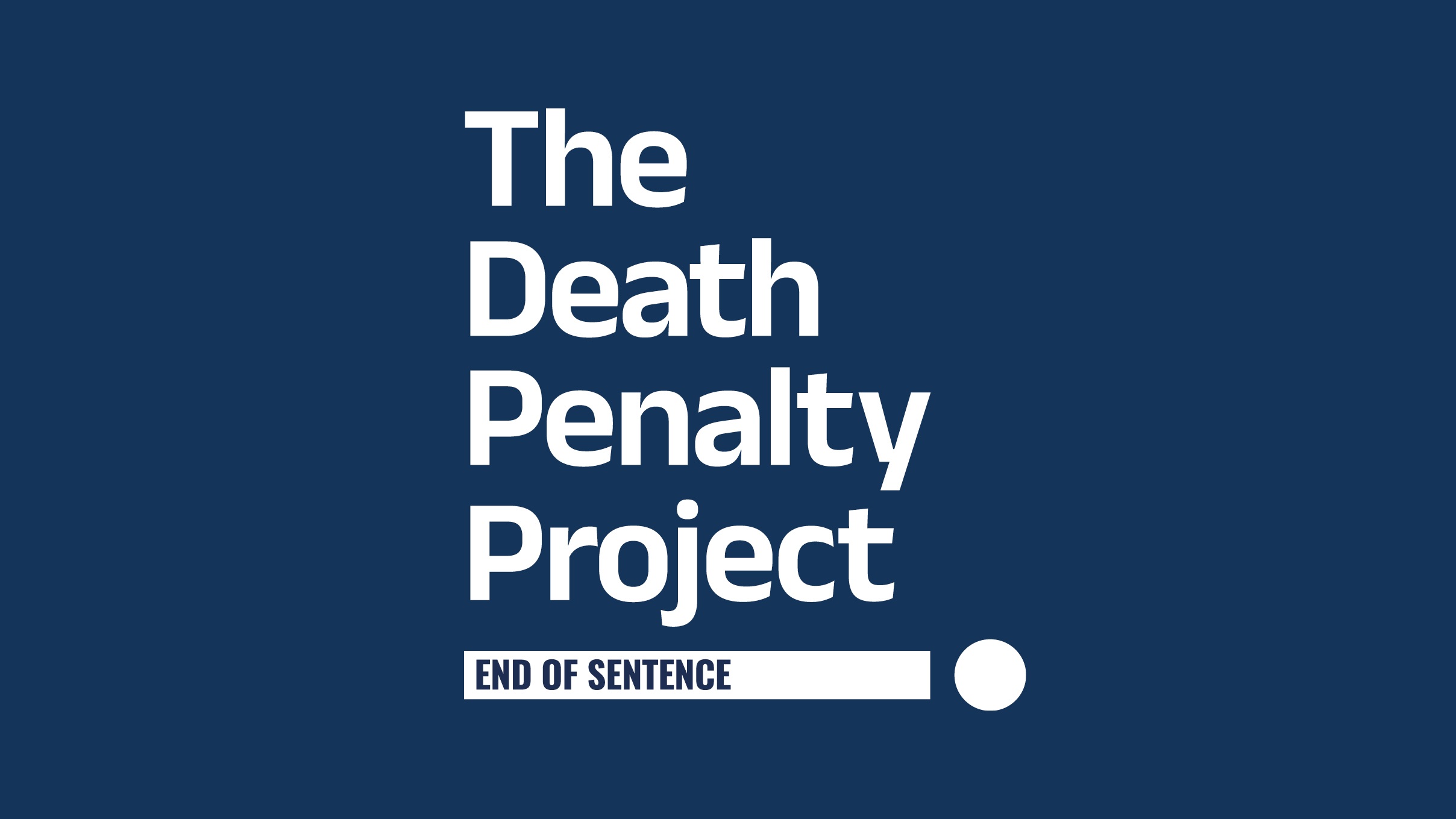
Visualising DPP’s new strapline ‘End of sentence’ was a key starting point. The creation of a brand graphic – composed of a bar and full stop – was an update of one of DPP’s earlier brand marks. However, this time Robyn made it more fluid and adaptable – rather than representing the bars of a jail cell, the bar could now be ‘toppled’ to indicate movement and that an ‘end of sentence’ can be achieved.
This initial visual statement also provided a starting point for the holistic vision for the wider brand identity.
“We chose a typographic approach for the brand assets,” says Robyn. “To complement the confident and matter-of-fact messaging, we selected a new sans-serif brand font, which would give character and clarity to all assets.
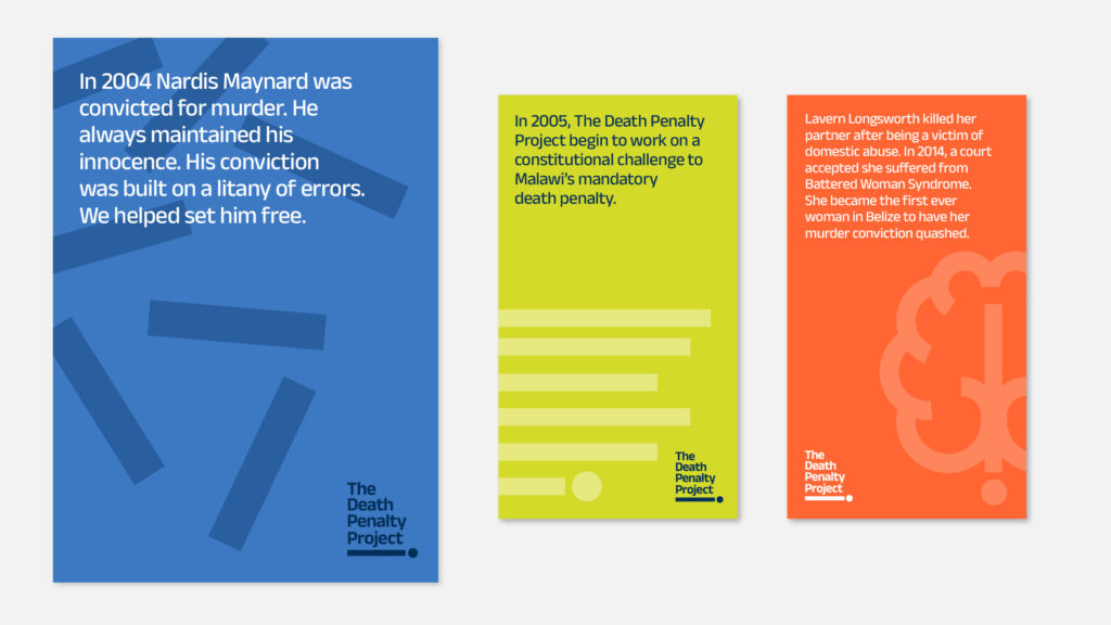
“For the palette, it was important to DPP to maintain the core brand colour of blue. So we expanded the blue palette, and added some bright ‘flash colours’ to add vibrancy and contrast to assets, and provide flexibility.”
The new visual brand has been used to create a complete suite of assets, including:
- Full visual identity guidelines, including guidance on posters, reports, and more
- Logo variations
- Ownable brand graphic
- Brand patterns
- Bespoke icon suite
- Visual wireframe for new website homepage
- Mini-animation showing the transition from the old brand to the new brand.
The new visual brand can now be seen on DPP’s relaunched website, across its social channels and on its latest annual report, also produced by CPL One.
Kate Arthur, communications lead at DPP says: “This year marks 50 years from when The Death Penalty Project’s organisational mission first took shape. We knew it was the right moment to take a step forward with a refreshed brand identity to reach new audiences and continue to pursue our ambition to end the death penalty.
“The team at CPL One helped us take that step, working with us closely and collaboratively. What they helped us deliver is an updated identity that confidently reflects the scale, impact and ambition of our work. We have already applied that visual identity across channels and know it will help support our purpose through the years to come. Thank you.”
Share this article
Related Articles
Relaunching a well-loved charity magazine for Versus Arthritis