Making magazines accessible demands a 360-degree view of your creative choices, says CPL One’s head of studio, Chloe Bage.
Designing to make printed publications accessible is a skill – and it’s one that many of our clients ask us to employ to make their magazines as inclusive as possible.
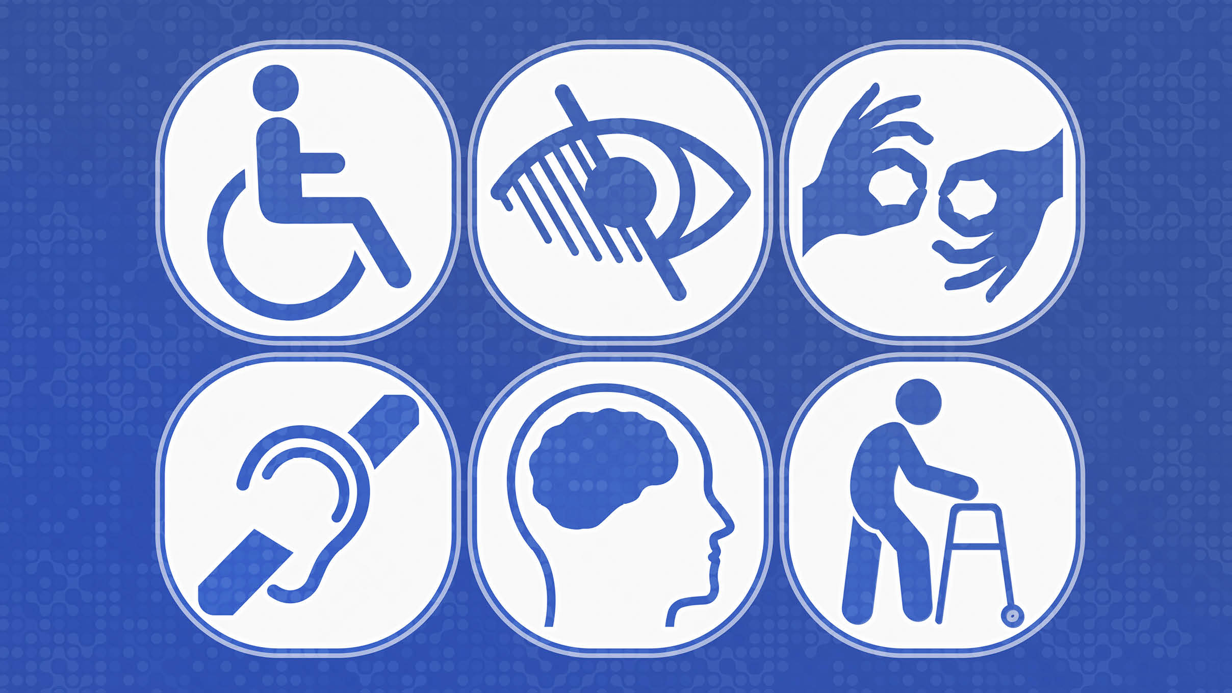
Accessible design means considering a wide range of variables to help readers who have specific visual, cognitive or physical mobility needs.
When designing a new magazine, you should take a 360-degree view of your creative choices:
Typography and legibility
- Use clear fonts that are easy to read – overly decorative or italic fonts can be difficult for people with dyslexia or low vision. Set a minimum font size for body text and allow for text resizing in digital formats.
- Check there is enough spacing between text characters, lines and paragraphs. This prevents text from looking like a dense block and helps readers track lines.
- Align text to the left and avoid justified text where possible, as it can be harder to follow.
Colour and contrast
- High contrast between text and its background is essential for readers with low vision or colour blindness.
- Never use colour as the sole means of conveying information, as some people may not be able to distinguish the difference.
- Glossy paper creates glare under some lighting conditions, which can be a barrier for readers with low vision. Choose an alternative paper stock where you can.
Layout and structure
- When you design a magazine page, keep a consistent hierarchy of headings and subheadings – this helps all readers understand the content’s structure.
- A cluttered page can be overwhelming and difficult for readers with cognitive disabilities or dyslexia – so keep your designs simple.
- For digital magazines, ensure the content is structured so that a screen reader follows the content in a logical, linear sequence.
Images and graphics
- Descriptive picture captions are a vital tool for accessibility. Make sure they clearly explain the content of the image and its relevance to the text.
- Ensure all charts, graphs and infographics are designed with simplicity and clarity in mind.
- Avoid placing important text over a graphic, as it can be hard to read.
Cognitive accessibility
- Use clear, concise and simple language. Avoid jargon, idioms and overly complex sentence structures.
- Break up long blocks of text using subheadings, bullet points and short paragraphs, to make the content clear and digestible.
Paper and print considerations
- Choose a binding method that allows the magazine to lay open flat, making it easier to handle for people with physical disabilities.
- Use paper that is thick enough to prevent text from showing through from the opposite side, which can be visually distracting and make it difficult to focus.
If you would like to know more about how we can help make your publications accessible, get in touch.